Explore Real Time Crypto Trades with D3.js
Build a scrolling timeline of live cryptocurrency trades. Powered by D3.js and Coinbase Pro.
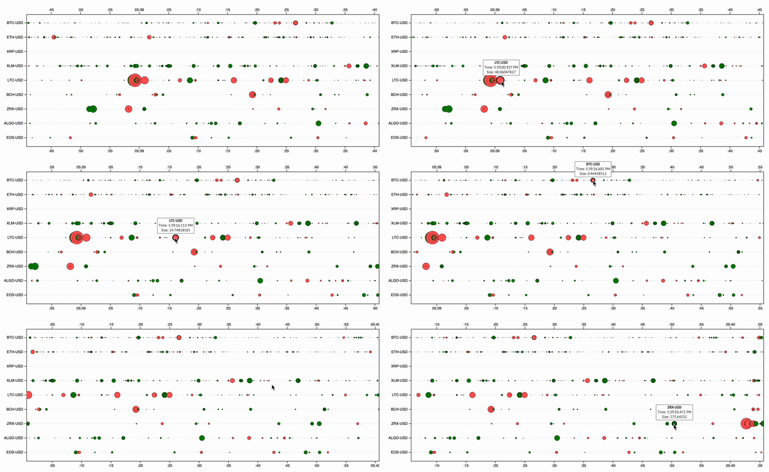
This tutorial shows how to create an animated chart based on my crypto-trades project. See a working demo here and the full project code here.
Trades are the fuel behind the price movement of cryptocurrencies. As exchanges constantly work to match up buyers and sellers, the price of a given cryptocurrency fluctuates based on trades that are happening every second.
Watching these trades live isn’t hard — Coinbase Pro’s website includes a trade history section that is continuously updated as they are executed.
What is harder is getting a better grasp on the volume, size, and sides of all the trades as they occur. Like many other datasets, a compelling visualization can reveal much more information than the numbers alone.
In this tutorial I will guide you along in building an interactive, animated chart that shows that last minute of various cryptocurrency trades from Coinbase Pro.
What You’ll Build
Our goal is to build the following chart:

The chart visualizes the last minute of real time trading information for nine different cryptocurrencies.
Individual trades are represented as circular nodes, which are animated across a scrolling timeline. New trades move in from the right and scroll for 60 seconds before exiting the chart.
Nodes are colored green or red to signify buy or sell orders, respectively. Their size is a function of the trade’s size relative to that crypto’s daily trade volume. Users can mouse over any trade to see its details.
Overall this chart can help us gain some insights into the constant flow trades — Which cryptos are most active? Which are fueled by larger orders? Are there any repeating patterns? All of these can be explored with this chart.
Project Setup
The setup for this project requires three files: index.html, main.css , and main.js.
Begin with an empty project folder an create an index.html file that contians the following code:
This html defines the basic structure of the page that will be viewable to the user. Importantly, it contains the <svg id="chart"></svg> element which will hold our chart created by D3.
Also included are links to the custom css file, and required JS files - D3, jQuery, and our custom JS file.
Next, in the project directory create a subdirectory called css and inside that create a main.css file with the following code:
This css file will control the styling for the page and chart, and its initial setup simply centers the contents of the page.
Finally, within the project directory create a js subdirectory, and an empty main.js file within it. This JS file will hold all of the code required to power the chart, which we’ll work on building out in the following sections.
Initialize the Chart
To begin, we’ll simply setup the basic structure of the chart — its axes and labels — and work on animating it and adding data in the next sections.
Start by defining which cryptocurrency products we’ll be visualizing. In the main.js file add the following code block:
// Define crypto product Ids
var product_ids = [
  "BTC-USD",
  "ETH-USD",
  "XRP-USD",
  "XLM-USD",
  "LTC-USD",
  "BCH-USD",
  "ZRX-USD",
  "ALGO-USD",
  "EOS-USD"
];
The product_ids array holds strings defining cryptocurrency trading pairs. Included are Bitcoin, Ethereum, and various other altcoins that trading data is availabe for.
This array is used for labeling the Y axis of the chart, and, more importantly, it is used later on when we subscribe to the Coinbase Pro websocket. Each pair follows the “BASE-USD” string format that the websocket expects.
Define the size and positioning of the chart, including margins for axis labels:
// SVG size params
var margin = {top: 40, right: 1, bottom: 50, left: 65};
var width = 960;
var height = product_ids.length * 40;
Note that the height of the chart is dependent on the length of the product_ids array. Adding or removing any of the trading pairs from this list will change the size of the chart.
Next, we define an svg D3 selection matched to the #chart SVG element we initialized in the HTML file. This variable will be the base selection that we append elements onto going forward:
// Define SVG
var svg = d3.select("#chart")
    .attr("width", width + margin.left + margin.right)
    .attr("height", height + margin.top + margin.bottom)
  .append("g")
    .attr("transform", "translate(" + margin.left + "," + margin.top + ")");
Create a timeDomain variable that will define the span of the x-axis:
// Set time domain placeholder
var t1 = new Date()
var t0 = new Date(t1.getTime() - 60*1000)
var timeDomain = [t0, t1]
Here the span is set from sixty seconds in the past until the current clock time. In the later sections we’ll be updating this domain value to create the scrolling animation, but for now we set it to a static value to initialize the chart.
Set the x and y scaling functions:
// Set scaling functions
var x = d3.scaleTime()
          .range([0, width])
          .domain(timeDomain)var y = d3.scaleBand()
          .range([0,height])
          .domain(product_ids)
          .paddingOuter(.1)
Both of these functions work to convert an input value into a new value that falls within the scale’s defined range. This is a powerful aspect of D3 which will allow us to easily position our data elements on the chart, without having to manually calculate where they should be.
The x function takes an input time value and scales it to a pixel value along the chart’s x-axis. The y function takes in one of the strings from defined in product_ids and scales it to a pixel value along height of the chart’s y-axis.
To help visually track the data nodes as they moves across the chart, we add horizontal grid lines with the following code:
// Add grid lines
svg.append("g")
    .attr('id', 'grid-lines')
  .selectAll(".grid-line")
  .data(product_ids)
  .enter().append("line")
      .attr("class","grid-line")
      .attr('x1', 0)
      .attr('x2', width)
      .attr('y1', d =>y(d) + y.bandwidth()/2)
      .attr('y2', d =>y(d) + y.bandwidth()/2)
Next define the top, bottom, left, and right axes and their tick settings, and append them to the chart:
// Set axes
var xAxisBottom = d3.axisBottom().scale(x).tickSizeOuter(0);
var xAxisTop = d3.axisTop().scale(x).tickSizeOuter(0);
var yAxisLeft = d3.axisLeft().scale(y).tickSizeOuter(0);
var yAxisRight = d3.axisRight().scale(y).tickValues([]);// Add X axis bottom
svg.append("g")
    .attr("transform", "translate(0," + height + ")")
    .attr('id', 'xAxisBottom')
    .attr("class", "axis")
    .call(xAxisBottom);// Add X axis top
svg.append("g")
    .attr('id', 'xAxisTop')
    .attr("class", "x axis")
    .call(xAxisTop);// Add Y axis left
svg.append("g")
    .attr("class", "axis")
    .call(yAxisLeft);// Add Y axis right
svg.append("g")
    .attr("class", "axis")
    .attr("transform", "translate(" + width + ", 0)")
    .call(yAxisRight);
D3 makes axis creation simple, where each of the top, bottom, left, and right, axes can be defined using D3’s axis functions. These functions define each axis and what scaling function it will utilize, and if they should display ticks and labels.
Finally, update the main.css file with the following styles to control the appearance of the gridlines and the chart’s margin:
#wrapper {
  margin-left: -65px;
}.grid-line {
  stroke: #f1efef;
  stroke-width: 1px;
}
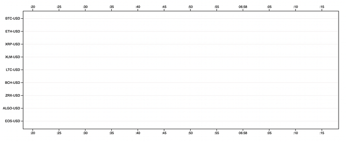
When done with all of the code additions above you can open the index.html file in your browser to see the basic chart we’ve setup:
Adding a Scrolling Timeline
The next step is to get the scrolling animation working. The goal is to have the x-axes ticks update with current labels and move from right to left with the passage of time.
This can be accomplished easily using D3. Since both axes utilize the x scaling function to determine their tick values and positions, repositioning can be accomplished by simply updating the function’s domain value.
By repeatedly upating the domain to include the most up to date time span, an animation scolling affect can be acheived.
Begin by updating the main.js file with the following line to define an offset variable with a value of 0:
// Init time offset
var offset = 0;
Its the case that sometimes the timestamps for the trading data we’ll be receiving will be slightly offset with our computer’s internal clock. The offset variable will be used to compensate for these differences so the nodes display correctly in real time.
Next, add the following getTimeExtentfunction:
// Return time extent to display
function getTimeExtent(){
  var now = new Date();
  var nowOffset = new Date(now.getTime() + offset);
  var dateStart = new Date(nowOffset.getTime() - 60*1000);
  return [dateStart, nowOffset]
}
This function returns an array of two values — the current time minus sixty seconds, and the current time — which will be used to update the x axes domain.
Note that here is where the offset is being applied — to the current time calculated from now.getTime(). Later when we start recieving trading data we’ll update the offset value depending on the data’s timestamps.
Add the following updateChart function:
// Update chart axis and data positions
function updateChart() {  // Update x axis with new times
  timeExtent = getTimeExtent()
  x.domain(timeExtent)
  d3.select('#xAxisBottom').call(xAxisBottom)
  d3.select('#xAxisTop').call(xAxisTop)
}
This function is responsible for getting a new array of time values from the getTimeExtent function, updating the x scaling function’s domain value, and then updating both axes by using their call method.
This function needs to be called repeatedly for the animation to take place. Add the following line to call updateChart every 20 miliseconds:
// Set interval callback
d3.interval(updateChart, 20);
With that final line of code added, open index.html in your browser to see the scrolling take place as seen below:

Subscribing to Coinbase’s WebSocet Feed
Coinbase provides an open, real-time websocket feed of trading data that we’ll make use of.
Websocket connections allow us to receive data from a server without having to explicitly make requests for it. Instead, an initial connection is made and our code listens for messages that are pushed out by the server.
Websockets are extremely useful for real-time data that gets pushed out at uneven intervals.
Get started by adding the following code block to the main.js file:
// CBPro websocket url
var url = 'wss://ws-feed.pro.coinbase.com';
var webSocket = new WebSocket(url);
Here we initialize a new WebSocket object using Coinbase’s websocket URL.
The Coinbase websocket expects clients to send a subscribe message to their server indicating which trading data they want to receive.
Add the following code to define the subscription data we will send:
// Define websocket data to subscribe to
var subscription = {
  "type": "subscribe",
  "channels": [
    {
      "name": "ticker",
      "product_ids": product_ids
    }
  ]
}
The subscription variable contains an object conforming to the service’s subscription requirements. Notably, it contains the product_ids array telling the websocket we want to receive trading data for all the trading pairs we defined earlier.
Add the following code to send this data to the server in JSON format when the websocket connection is first opened:
// Send subscription data
webSocket.onopen = function (event) {
  webSocket.send(JSON.stringify(subscription));
};
After subscribing, the websocket will push trading data to our code, so we need to handle that incoming information:
// Handle incoming messages
webSocket.onmessage = function (event) {

  // Parse message JSON
  var data = JSON.parse(event.data)  // Process ticker messages
  if (data.type == 'ticker') {
    console.log(data)
  }
}
Here we define the onmessage property of our webSocket object as a custom handler function. Each time a message is recieved from the websocket this function will execute with the message event data passed as a parameter.
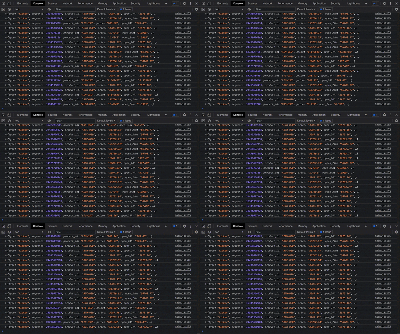
For our chart we are only interested in ‘ticker’ messages sent from the websocket. The function filters for these messages and prints out the parsed data to the console.
With the above code added to the main.js file, open index.html in a browser and view the developer tools console. Trade data recieved from the websocket will be printed out, and you can explore the content that each trade contains.
Adding Trades to the Chart
Now that we are successfully subscribed to the websocket and are recieving data, we’ll work on visualizing each trade as a node on our chart.
In the main.js file add the following line of code:
// Init trade data
var trades = []
Our visualized trading data will be held within the trades array, which we will update as new trades are recieved and older trades move out of our timeline.
Next, under the console.log(data) line in the websocket.onmessage function, add the following code:
// Add message data to trades
data.dateObj = new Date(data.time);
trades.push(data)
In addition to simply printing data from the websocket to the console, we are now appending it to the trades array.
Add the following code block underneath the previous block, still inside the websocket.onmessage function:
// Define offset
if (offset == 0) {
  var now = new Date();
  offset = data.dateObj.getTime() - now.getTime();
}
Here we are calculating any offset that exists between the timestamps of the trading data and our computer’s clock.
As explained earlier, sometimes this can be out of sync depending on our computer’s clock, and the offset value is used to compensate for that.
The node elements we create will be contained inside a their own SVG element for visualization purposes. Define the container by adding the following code block right below where the grid lines were defined earlier:
// Container for node elements
var container = svg.append("svg")
  .attr("width", width)
  .attr("height", height)
Next, we’ll define another D3 scaling function that will be used to determine the size of each of the trading nodes. Add the following code block below the x and y functions definitions:
var r = d3.scaleSqrt()
          .domain([0.0,1.0])
          .range([0,height])
          .exponent(0.4)
We want each node’s radius to be scaled according to to the trade’s size relative to that product’s daily volume. This function will allow us to pass in this ratio of values and get back a radius value in pixels.
Next, inside the updateChart function, at the end, add the following:
// Filter out trades that are outside timeline
trades = trades.filter(function(trade){
  return trade.dateObj > new Date(timeExtent[0].getTime() - 5000)
})
Each time the updateChart function is called and the domain of the x scaling function is updated, it will reposition the nodes as we will soon setup.
Eventually nodes will move outside the timeline boundaries and become unviewable. The above code block deletes any trades that are older than 65 seconds, five seconds outside our our left bounding range.
This ensures that our trades array won’t keep growing and holding data that is no longer useful.
Next, still in the updateChart function, we use D3 to join our trades array data to the SVG elements that will make up our nodes:
// Join trade data to cirle elements
var circles = container.selectAll('circle')
                       .data(trades, d => d.trade_id);
This selection looks for all circle elements and binds the trade data to them.
Since we are removing trades from the trades array as they become too old using the filter method above, it is important to remove any existing nodes that were joined to these now-removed trades:
// Remove unbound elements
circles.exit().remove();
Next we define the enter and merge actions to that should be taken on the selection:
// Create new cirle elements and update positions of existing ones
circles
  .enter()
    .append('circle')
      .attr('class', d => d.side)
      .attr('r', d => r(d.last_size / d.volume_24h))
      .attr('cy', d => y(d.product_id) + y.bandwidth()/2)
  .merge(circles)
    .attr('cx', d => x(d.dateObj))
The enter method applies to any newly added trades values which don’t have a corresponding circle element joined to them yet. In this case a new circle is created and its atrributes — class, radius, y-position — are defined.
The circle’s class with be set as either 'buy’ or 'sell’ depending on the side property of the trade. We’ll style the circle’s color depending on this class. The circle’s radius value utilizes the r function we defined earlier.
The merge method applies to both newly added trades values and already existing ones. Here the x-position of each circle element updated.
By passing the trade’s dateObj value through our x scaling function, we can generate an updated pixel position that changes with each iteration as the x function’s domain value is altered. This will allow nodes to animate from left to right with each call of the updateChart function.
Finally, we update the main.css file with the following stylings to control the appearance of the circle elements and their two possible classes:
circle {
  fill: #c5d7ea;
  stroke: black;
  stroke-width: 0.5px;
  opacity: .5;
}.buy {
  fill: green;
}.sell {
  fill: #ff5959;
}
With the above code added, open index.html in your browser to see the chart now populated with live trading data:

Adding Tooltips
The last part of this project is to add informational tooltips to the nodes. This allows users to mouse over any trades and see their currency, timestamp, and size.
The tooltip will be a div element that we show, hide, reposition, and change the text content of based on mouse interactions with the nodes.
Begin by adding the following stylings to the main.css file:
#tooltip {
  position: absolute;
  padding: 1px 3px;
  background: white;
  border: 1px solid grey;
  border-radius: 1px;
  pointer-events: none;
  text-align: center;
  white-space: nowrap;
}#tooltip p {
  margin: 0px;
  padding: 0px;
  font-size: 10px;
}.hover {
  stroke-width: 2px;
}
Next, in main.js, create a new tooltip variable which is an appended div with its opacity initialized to zero:
// Create a tooltip
var tooltip = d3.select("body")
                .append("div")
                  .attr("id", "tooltip")
                  .style("opacity", 0);
In order to correctly position the tooltip ontop of our SVG elements, we need to function that helps translate between the browser’s coordinate system and the SVG coordinate system.
Add the following getMatrix function, which takes in an SVG element and returns a DOMMatrix transform matrix:
// Calculate matrix for mouse offset
function getMatrix(circle) {
  var matrix = circle.getScreenCTM()
    .translate(+ circle.getAttribute("cx"),
               + circle.getAttribute("cy"));  return matrix
}
Next we define callback functions for the various events that are generated by interactions between the mouse cursor and the node elements — mouseenter, mouseout, and mousemove.
The mouseenter event is generated once when the cursor initially moves over an element. Add the following callback function for this event:
// Callback for mouse movment out of circle
function mouseenter(d) {  // Toggle hover class
  d3.select(this)
    .classed('hover', true);  // Update tooltip content and position
  var matrix = getMatrix(this);
  var radius = parseFloat(this.getAttribute('r'));
  var ms = d.dateObj.getMilliseconds();
  var timeSting = d.dateObj.toLocaleTimeString().replace(' ','.' + ms + ' ')

  tooltip
    .html("<p><strong>" + d.product_id + "</strong></p>" +
          "<p>Time: " + timeSting + "</p>" +
          "<p>Size: " + d.last_size + "</p>")
    .style("left", (window.pageXOffset + matrix.e - $("#tooltip").outerWidth() / 2) + "px")
    .style("top", (window.pageYOffset + matrix.f  - $("#tooltip").outerHeight() - radius - 3) + "px")
    .style("opacity", 1)
}
When this event happens the tooltip is repositioned above the cursor and set to visible. Its contents are be updated to include that node’s trading data, and the node’s class is set to hover.
The mouseout event is generated once when the cursor moves off of an element after already having moved over it. Add the following callback function for this event:
// Callback for mouse movment out of circle
function mouseout(d) {

  // Toggle hover class
  d3.select(this)
    .classed('hover', false);  // Hide tooltip
  tooltip
    .html("")
    .style("opacity", 0);
}
When this event happens we want the tooltip set to invisible and its contents erased. The hover is also removed from the node.
The mousemove event is generated each time the cursor moves anywhere over an element. Add the following callback function for this event:
// Callback for mouse movement in
function mousemove(d) {

  // Update tooltip position
  var matrix = getMatrix(this);  tooltip
    .style("left", (window.pageXOffset + matrix.e - $("#tooltip").outerWidth() / 2) + "px")
}
This function is simply responsible for repositioning the tooltip according to the mouse position, it does not control its visibility like the other callbacks.
Finally, we update node creation code to link these events to our callback functions. Update this code block from the last section to include the three .on() functions seen below:
circles.enter()
  .append('circle')
    .attr('class', d => d.side)
    .attr('r', d => r(d.last_size / d.volume_24h))
    .attr('cy', d => y(d.product_id) + y.bandwidth()/2)
    .on('mouseenter', mouseenter)
    .on('mouseout', mouseout)
    .on('mousemove', mousemove)
  .merge(circles)
    .attr('cx', d => x(d.dateObj))
With the above code added, open index.html in a browser to see the completed chart. Use your mouse to hover over any of the nodes to display their trading information:

Conclusion
This tutorial guided you in building in interactive, animated chart powered by D3. You also got a quick tutorial on websockets and were able to connect to Coinbase’s websocket feed to view data in real time.
From here you can experiment and build out the tool further — add more cryptocurrencies to view, change it to view the last 10 minutes of trades, add noise cues when new trades are created. There are lots of possibilites.
Be sure to check out the live working demo of the tool and its full code repository.
